What’s the first thing everyone looks at in person? Stop wondering and read carefully because the question has the answer you seek. Looks and appearance.
What Does An Amazing Website Functionality Consist?
Online websites are no different from people in real life in this regard. Your website also needs to be fully professional.
Today, every web user compares their experience based on the interface and navigation of a site. If they like the look and feel, they will stay and visit your site frequently. However, if things go south, you might not only lose a visitor but also the referral traffic that the same visitor might bring along.
Hence, to make a first lasting impression, you need to focus on all the aspects of what makes a business’s website look professional. Luckily, we are here! Your guide to designing a professional and appealing website. Without further ado, let’s jump straight at the solution.
What Things Can Make Your Website Stand Out?
When it comes to the question of how to make your website look more professional, outlining a single aspect is not possible, as multiple aspects are involved that shape and enhance the overall appearance of your site.
Below is a list of pointers that make your website appear professional and appealing —
- Professional, captivating, and sleek design
- Quality and relevant content
- Appealing creatives
- Mobile-first design
- Seamless & uninterrupted navigation
- Alluring fonts
- Color palette
- Robust functionalities
- Proper organization
- Accurate content details
Now that you have the synopsis of the aspects elevating the look of your website. Let us give you a detailed understanding of the same.
Also Read: What Makes a Good Website Checklist? A Complete Guide
How To Make A Website Attractive And Professional?
➢ Design
The initial and foremost crucial factor to bear in mind is the design of your website. As soon as users click on the URL of your site, they will observe the colors, typography, imagery, and similar other aspects leading to a good or bad user experience.
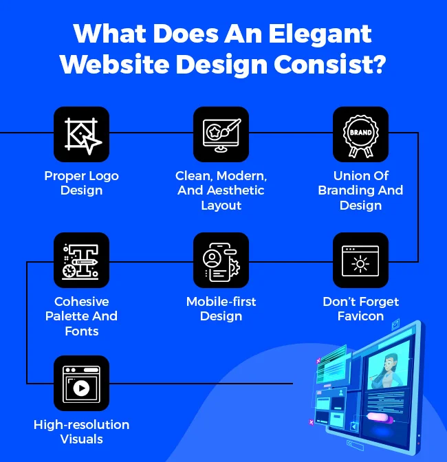
What Does An Elegant Website Design Consist?
➔ Proper Logo Design
A logo is a visual representation of your company. If you want to bring your company into the limelight, ensure your logo is appealing and exhibits the essence/spirit of your company.
Logo designing is far more than just pretty visuals. You need to follow certain rules to create a balanced and thoughtful design. Start by exploring conceptual ideas. Research is a key factor at the start of anything. You can pursue different brands based on the niche of your business.
Supposedly, if you own a clothing brand, you can comprehend the designs of Chanel, Adidas, H&M, etc. Emphasize making it easily recognizable so users can recall it without probing too much.
Try experimenting with case letters and different font styles, especially handwritten fonts. This creative typography has certainly been preferred for logo designs as it gives a quirky yet authentic feel.
Ensure that your tagline is balanced and has limited yet impactful words. Your logo should be timeless and scalable for updating based on requirements. Don’t forget to analyze your competitors to create a unique design.
Also Read: What Are The Benefits Of A Website For Small Businesses
➔ Clean, Modern, And Aesthetic Layout
Would you like your workspace or home messy? No, right. The same goes for your website. Your website should be clean with minimal content, images, and other elements. It should not confuse visitors. Instead, it should give a seamless browsing experience.
This is why we recommend you position the elements of your site carefully. Every image, content, video, feature, and so on should be in its place. Nothing should overlap to streamline an optimal and engaging user experience.
Like your logo, the layout of your website should also be aesthetic, followed by modern trends. The era calls for minimalist & professional website designs. Be its the menu bar, creatives, unique fonts, utilizing white space, or using high-resolution product images & videos. Everything should impact the intended audience in an impressive way.
➔ Union Of Branding And Design
It would be great if your branding strategy is associated with your design. It looks attractive, and people can easily recognize and recall your company.
For instance, Let’s look at leading delivery service aggregators — Zomato, Swiggy, and Blinkit. One common thing you might notice between all three of them is that their uniform is coherent with their brand’s color. They even imprint logos on the front and back of the uniform to advertise their brand.
This was a single example of what we wanted to illustrate. You will notice the same pattern if you scroll through their social media accounts. From the display picture to posts, everything is surrounded by their theme.
This is why we recommend following the amalgamation of branding and design to bring out a distinctive identity.
➔ Cohesive Palette And Fonts
Many web owners think experimenting with multiple colors and fonts will improve the look of their website. But let us tell you; it is a strict NO…NO!! Using a variety of fonts and colors will disrupt the look and feel of your website. Plus, it looks unprofessional, and users won’t be able to comprehend your brand.
Instead, focus on using consistent colors and fonts across all the platforms — website, social media, email marketing, business card, etc. Consistency builds your brand since it becomes a touch point for users and clients to recall your brand. It also looks professional and sustains credibility among your target audience and clients.
Always keep your overall vibe uniform to make your brand memorable and win the loyalty of your targeted audience.
Also Read: 9 Popular Types Of Websites
➔ Mobile-first Design
For readers unfamiliar with a mobile-first design, this term refers to an approach followed by web designers and developers in creating a website that gives a seamless experience among mobile users. Usually, the developers follow on creating designs for small screens first, later moving forward to bigger screens.
Why should mobile-first design be anyways considered? Did you know 60.67% of traffic comes from mobile phones? If we head back in time, around 2012, the mobile traffic was merely 10.88%. Fast forward to 2017, the traffic increased by five-fold, making it 54.09%.
The above statistics show that most users visit a website through mobile, which is why it is paramount to perform mobile optimization to give a personalized and seamless user experience.
Ensure your content, images, videos, and other website elements are adjusted according to different screen sizes. If you don’t, your site will be unresponsive on different screens, which will cause a disrupted user experience.
➔ Don’t Forget Favicon
For readers not acknowledged with the concept of favicon, this term refers to identifying your site among different tasks bar. Simply put, this graphic icon is related to your webpage/website and is generally added as a reminder or identifier to locate your webpage/website among multiple opened task bars.
Favicons are like a bookmark. They tell you where you were last. Supposedly, you started reading a book today and finished reading 10 pages of the same. The next day you again pick the book to continue reading. However, you can’t find the page you last read because you didn’t bookmark it.
The same goes for the favicon. If your site/page doesn’t follow the practice of implementing a favicon, other users won’t be able to identify your site leading to a lost visitor.
Implementing a favicon, especially for web users, is crucial to give users easy and quick recognition of your website among multiple opened tabs. This also shows that your site is professional and has consistent branding.
➔ High-resolution Visuals
Do you have a television at your home? If yes, imagine you are watching your favorite film/series. However, its visual quality is not up to the mark. Would you enjoy watching on such a screen? No, right.
Like you, your visitors won’t enjoy or like watching low-quality visuals. Hence, high-resolution images and videos are significant for the ultimate user experience. High-quality images also improve text readability and enhance the probability of visitors buying your product.
Most shoppers will purchase products with high-resolution images and 360 view. Upon implementing high-quality visuals, you improve the chances of lead conversion.
Let’s have a Recap, What does an elegant website design consist of with an Infographic below:
Also Read: Website Builder Vs WordPress – Know The Difference
➢ Navigation
Navigation of a site is the second most important factor when developing a website. Besides having a clear structure and intuitive navigation, considering other factors such as placement of elements, prioritizing web content, etc., to make a site’s navigation smooth
Also Read: Types of Website Navigation – A Detailed Guide
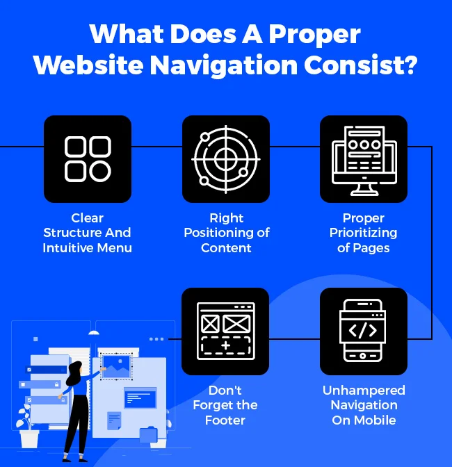
What Does A Proper Website Navigation Consist?
➔ Clear Structure And Intuitive Menu
Often, web owners mistake of including everything in one, thinking visitors will get all the information that will make them stay and visit frequently your site. Although, it’s the exact opposite of what you think. This will cause your sight to appear topsy-turvy.
Ensure your site/page has appropriate content to avoid this mistake. It should not be more or less. The content limit should be based on the requirements and the topic of the page/site. This keeps your site orderly and provides seamless site navigation.
Besides the content, visuals should be in their appropriate area and not congruent with the other images and videos.
Mind you, the easier your website is to use, the more web users will visit it frequently. Hence, it is imperative that you keep your site menu visible. Users should be able to locate the menu without spending too much time and effort.
Visitors expect to locate the menu bar on the top and below a site. These are the most standard practices you must follow. For mobile users, you can create a vertical or horizontal menu bar.
➔ Right Positioning of Content
Right positioning refers to the placement of the CTA button, product or service pages, social proof, contact information, cookies button, and similar elements for easy accessibility. Many web owners tend to miss out on the placement because of the multiple elements involved in a particular page or site. This causes confusion among visitors visiting the site/page as they cannot determine the features and functionalities.
This is why all the primary features should have the right placement. For instance, the CTA should be mentioned in the top right corner of the site.
The product or service menu bar should be at the top in the center, and the contact form should be on the contact us page, and so on. You must follow the standard placement practices to ensure web users can find everything intuitively.
Also Read: Complete Guide To The Content Management System
➔ Proper Prioritizing of Pages
Prioritizing a reasonable amount of website content and pages are a sign of a professional website. You must ensure that your site has the required amount of pages. A standard website has 8 to 12 pages, including a home page, service/product pages, about us, contact page, our team, terms, and conditions, & most important, the privacy policy on the website.
In addition to the standard pages, you must determine how many other pages your website would need. Once you calculate the number of pages, the next step is prioritizing page placement. You will decide which pages will be placed at the top and bottom and which ones will not be displayed.
For instance, pages like about us, services/product pages, their landing pages, contact us, and so on are highlighted at the top as web users initially look out for them. As for terms & conditions, sitemap of a website, and similar pages, others are indicated below the website in the header. Prioritize which pages you would want your targeted audience to see.
The footer doesn’t have any relation with the technicalities of the site. Your site will function seamlessly with or without a footer. However, the footer is paramount for users or clients visiting your site. Footer generally has all the site elements that can lead visitors to the location they plan to explore.
If your site does not have a footer, users will not be able to find the other pages of your site. For them, these hidden pages are non-existential. Plus, you might be unable to redirect the traffic to a certain page since they are nowhere to be found.
Your footer should include your company’s logo, contact information, and important links such as copyright infringement, privacy policy, legal information, etc. Social networking links, email sign up, and other page links should also be a part of your footer.
Mobile navigation is as important as compatibility on different screens. Most website traffic comes from mobile devices, which is why it is vital for your site to offer unhampered navigation to mobile users. Navigation is a touch point for users which will be used by them as a medium to interact with your site.
Unhampered mobile navigation increases the chances of web users exploring your app and additional features. It should be evident and intuitive. Since every mobile device is different, with a variety of sizes and shapes. It is essential that the icon, bar, or button size on the site should be big enough to tap effortlessly.
If your site has gesture-based navigation, the UI pattern should be easy to grasp, immersive and interactive to create a dynamic experience.
Let’s have a Recap, What does a proper website navigation consist of with an Infographic below:
Also Read: How To Set A Budget For Your Business Website Development
➢ Content
Previously, we discussed the aspects of a site based on user experience and interaction. Starting from design to navigation, we cleared every aspect involved in the same. We shall now discuss the textual and writing part of a website.
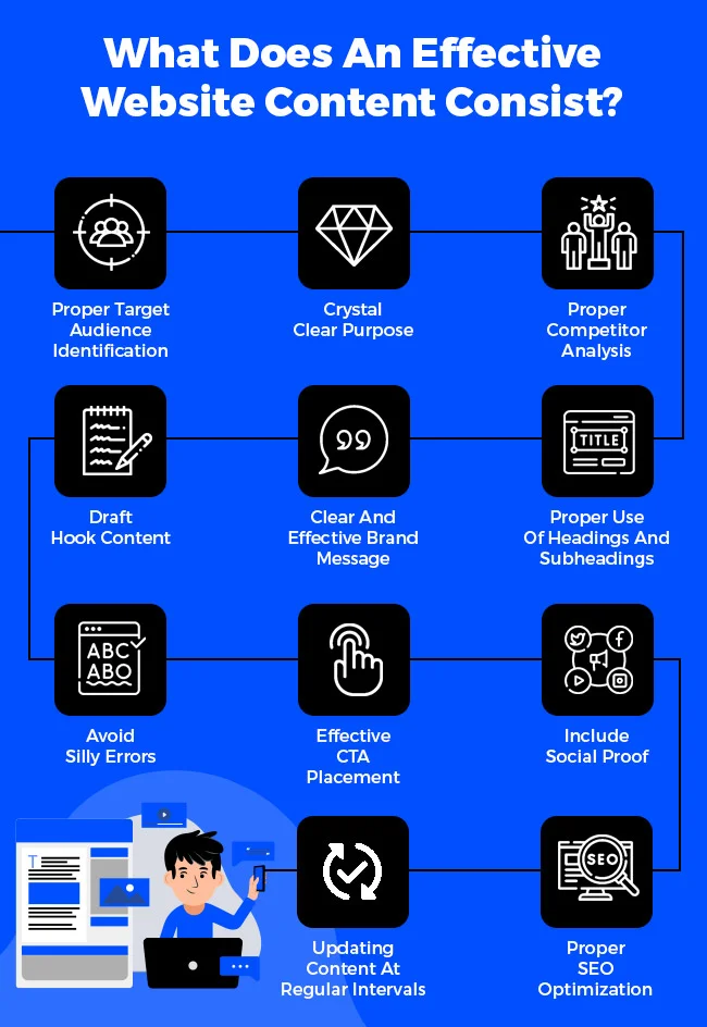
What Does An Effective Website Content Consist?
- Proper Target Audience Identification
- Crystal Clear Purpose
- Proper Competitor Analysis
- Draft Hook Content
- Clear And Effective Brand Message
- Proper Use Of Headings And Subheadings
- Avoid Silly Errors
- Effective CTA Placement
- Include Social Proof
- Proper SEO Optimization
- Updating Content At Regular Intervals
➔ Proper Target Audience Identification
Many writers and web owners make the mistake of publishing content without clearly identifying their audience. The target audience is defined to reach the right audience.
For instance – if you have an online wedding site, who do you think will be your target audience? Of course, the people planning to get married and other relatives who plan to buy ceremony outfits. However, would it make sense for you to include keywords and make content related to shopping for Western clothes? No, right.
This is why defining your target audience from the beginning is important to generate effective results. You need to identify your target audience based on niche. Map out a marketing strategy, perform competitor analysis, leverage social media, and find relevant keywords. Doing so will save you time, money, and effort.
➔ Crystal Clear Purpose
What is the purpose of your web content? Ask this question to yourself and plan your content accordingly. For instance, is your content to educate, guide, entertain, or inform the audience? Or is there any other purpose, such as establishing site authority, generating leads, increasing traffic, and so on?
Ensure your site content should be well-defined and adds value to the audience. So that they can visit your site frequently.
➔ Proper Competitor Analysis
If you want to stay a step ahead and beat your competition, it is necessary for you to perform competitor analysis. Competitor analysis helps you identify your competitors’ services, products, and other offerings. You can also check the keywords and density they use. Most importantly, you will be able to discover their weakness and strengths.
These detailed insights will help in building a full-fledged strategy that can be used to outperform the competition and fill the gaps that might be lacking in your site.
Competitor analysis also helps grab customer attention. If your site is superior to your competitors, users will remain engaged with you, leading to an increase in traffic.
Also Read: 15 Best SEO Audit Tools For Your Website (Free+Paid)
If you want to stay a step ahead and beat your competition, it is necessary for you to perform competitor analysis. Competitor analysis helps you identify your competitors’ services, products, and other offerings. You can also check the keywords and density they use. Most importantly, you will be able to discover their weakness and strengths.
These detailed insights will help in building a full-fledged strategy that can be used to outperform the competition and fill the gaps that might be lacking in your site.
Competitor analysis also helps grab customer attention. If your site is superior to your competitors, users will remain engaged with you, leading to an increase in traffic.
➔ Draft Hook Content
Hook content refers to a type of content drafted to capture readers’ attention. This includes short yet appealing headlines, compelling phrases and idioms, captivating introductions, relatable examples, etc. The idea behind writing hook content is to grab the attention of potential readers and increase readership.
Regarding the website content, hook content is written to attain a specific goal. Let’s assume your goal is lead conversion. You will write clickbait descriptions, CTA, and engaging taglines to encourage users to a certain action.
Drafting hook content is a tough nut to crack. You need to pay attention to your audience, their preferences, interests, and pain points, which can be done through constant user interaction in comments, social media, etc. Once you figure out all the aspects, drafting content becomes relatively easy.
➔ Clear And Effective Brand Message
Think about one thing that sets you apart from your competitors. The first thing that appears in your mind is your unique value proposition which can be marketed concisely and compellingly to exhibit your company’s essence. If you look at Amazon, it’s a customer-centric company whose motto is to provide everything shoppers are searching for.
Like this accredited brand, you must clearly determine and market your motto for strategic and consistent branding. Never confuse your audience with a vague brand message.
➔ Proper Use Of Headings And Subheadings
Headings and subheadings are equally significant for your content because the right formatting helps grab customers’ attention. It would be great to include keywords relating to the theme/topic of the webpage to alert search engines to index your page and make it appear among the targeted audience. Make sure they are easy to comprehend, simple to read, and coherent with the topic.
Keep the headings and subheadings in chronological order. Following a well-defined manner makes your content appear concise, powerful, and persuasive to readers. For instance, your webpage will first have the title, also known as the page name or topic. Later, you will include other sections such as H1 (first heading), H2 (Subheading), H3 (Subheading), and H4 (Subheading).
Mentioning and linking the headings and subheadings at the top of the content helps users find what they seek. For instance, your blog is about content marketing, and if you link the pointers (headings and subheadings) in the content bar above, readers can click on the particular content and jump directly to their clicked topic.
Here are a few things to avoid when writing headings or subheadings –
- Avoid Italicize or any other styling
- Don’t use high-end or clever words that are difficult to comprehend
➔ Avoid Silly Errors
This point, we think, goes without saying. Regardless of what you write, an Email, social media plan, or website content, ensure that it has zero errors or inaccuracies. The error refers to spelling, grammatical, sentence formations, tonality, addressing the person, factual errors, misleading information, plagiarized, incomplete, or outdated content.
Be sure to avoid these errors or inaccuracies in your content, as your piece of work will be published and read by everyone on the internet. Even the slightest mistake can be noticed or pointed out by readers, damaging your credibility and image.
Also Read: How You Can Find Bugs in Websites Manually?
➔ Effective CTA Placement
CTA, or call to action is one of the most preferred ways to encourage users to take action. However, this magical formula won’t be effective if not visible and rightly placed. To make it visible, use attractive colors such as red, yellow, green, and blue and a simple font style. Don’t forget to manage the size of the CTA to make it touch-friendly.
Keep the CTA short, clear, and effective such as Get Your Trial Now, Sign Up For Free, Get Free Consultation, Hire Now, and Call Today. Don’t forget to add CTA in multiple areas. Multiple placements reduce the odds of people missing out. In fact, they don’t have to scroll all the way to the top to take action.
Here’s a tip when creating a CTA. Your CTA should trigger the pain point of your targeted audience. It should be beyond those conventional Buy Now and Book Now CTAs. It would be great if you draft a compelling copy such as Get Glow-up From Within, Save Taxes, Stop Losing Your Hard-money, or Tap To Get Hefty Discounts.
Personalized CTA has a better chance of impacting your target audience than regular ones.
➔ Include Social Proof
Always link your social media accounts to your website. You can redirect the website traffic to your social media to double your social media efforts. Although, you have to consider a few factors to make it happen. Generally, social media links are mentioned in the footer of a website. But we recommend you link them at the top to capture users’ attention.
Including the accounts that are active and up-to-date would be a great idea because linking outdated or unavailable accounts lead to customer attrition. Following these small practices will help in enhancing your overall digital presence and interaction.
➔ Proper SEO Optimization
If you are a writer or marketer, you will know why optimizing your content and website for SEO is important. This long-term SEO strategy is a sure-shot way to visibility, ranking, conversion, increasing traffic, and attaining any desired goal.
For content optimization, you must heed certain factors, such as using the right volume of relevant keywords, drafting easy-to-read and quality content, using headings & subheadings, writing compelling meta descriptions, & tags, and using primary keywords in the same.
Finally, the approach to writing your content should be based on search engines and targeted audiences to sustain relevancy and consistency.
For SEO optimization of your site, do map out an effective strategy. Start with keyword research, build quality content, place your keywords in the right density & area, and perform internal & external linking. You also need to optimize the visuals of your site by adjusting their size and resolution. You must keep your URL structure short, relevant, and straightforward.
Here’s how you ensure your content gets read by the masses and noticed by search engines.
Also Read: Best (Paid+Free) SEO Tools For The Best Performing Website
➔ Updating Content At Regular Intervals
Unlike blogs, website content is not updated constantly. Although, it doesn’t mean you won’t tweak or refresh your site for a longer duration. To stay relevant in the market, keep your audience engaged, and stay at the top of the trends, updating content is recommended. Keep an eye on the alignment and the quality of the content.
Your content should not have any outdated or incomplete links and information. Monitoring the data and user activity to tailor the site experience to the targeted audience’s needs and preferences is advised.
Replace old keywords with new phrases to stay relevant. Finally, be attentive to your competitors. See what changes they make on their site and which content practices and strategies they follow. How frequently do they update their content, and how is the quality of their content?
Focus on these things, and you will thank us later!
Let’s have a Recap, What does an effective website content consist of with an Infographic below:
Also Read: Blog VS Website: The Difference You Need To Know As A Beginner
➢ Functionality
Since we have given a clear perspective on design, navigation, and content for your site. Our next question in line is functionality.
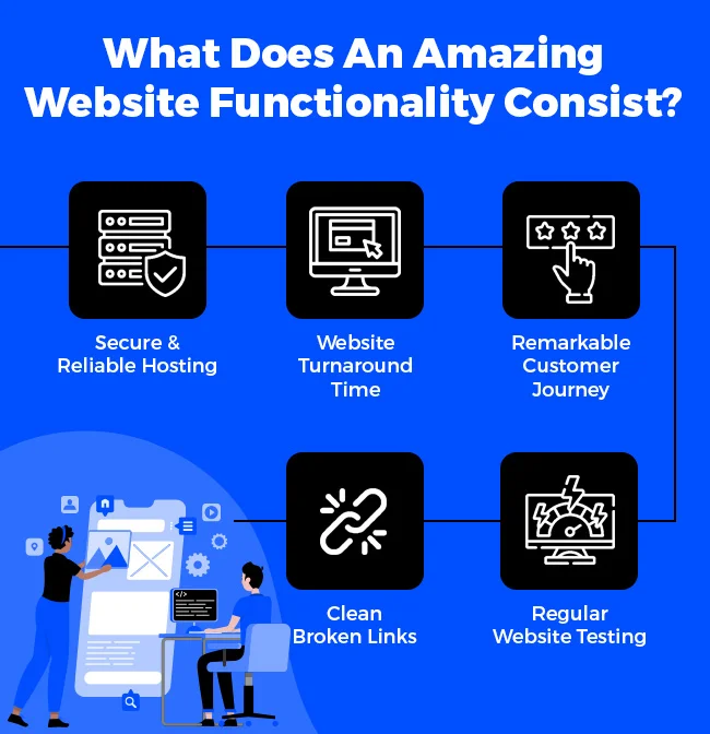
What Does An Amazing Website Functionality Consist?
➢ Secure & Reliable Hosting
Let’s assume your site is all set to launch on the internet. You even launch it successfully. A few days later, it gets attacked by malware, and your months of hardships get lost in a fraction of a second. Why? Because you chose an unreliable hosting provider.
Things like these cannot return to normal but can be prevented by choosing a secure and reliable hosting company. As a beginner, you must make tons of considerations before choosing the right provider. Start by choosing the type of hosting.
Generally, there are 4 primary types of hosting — shared, VPS or virtual private server, dedicated, and cloud hosting. Since you are at the initial stage, we recommend you go for shared hosting, which is cost-effective and perfect for startup sites. Again, the choice of hosting will depend totally on your requirements.
After selecting the type, look for must-have features, such as bandwidth usage, hosting storage space, SSL certificates, security, and website backup. Apart from these, you also need to ensure that the chosen plan gives a swift performance and has easy scalability, & management.
Always remember to choose a plan that fits your needs and budget. The plan should be flexible and have essential features at a nominal cost to cover your requirements.
Also Read: 5 Things Small Business Should Know About Web Hosting
➢ Website Turnaround Time
Even if you have an excellent site with appealing design, quality content, and robust features, you still will be beaten in the race of being at the top, if your website loading speed is slow. According to statistics, the ideal turnaround time of a site should be 1 to 2 seconds because more than 2 seconds of delay will result in abandonment rates of up to 87%, which is not a good sign for any website.
To begin with, run a website speed test on platforms like Lighthouse and PageSpeed Insights. Check the results you get through the insights.
To avoid a delay in loading speed, always focus on choosing a hosting solution ensuring high performance. Compress and optimize the website images to reduce the delay. Remove the cache from your web pages, and eliminate the unnecessary code from your CSS, Javascript, and HTML files.
You can also implement CDN across your server to reduce the latency and maximize performance. Don’t forget to enable browser caching, as it stores different information and visuals on the browser, so users don’t have to click refresh every time they visit. This also allows users to head back to previous pages pretty quickly.
Also Read: How To Fix A Slow Website?
➔ Remarkable Customer Journey
The term customer journey refers to a customer’s overall experience with a brand/company. The journey begins when customers visit your site and discover your offerings to meet their needs. However, this journey can turn into failure if not planned carefully. Meaning you have to build a roadmap for the journey to stimulate users to take action.
Generally, the customer journey has 5 stages —
- Awareness – This initial stage involves creating awareness about your offerings to the visitor on the site.
- Consideration – The second stage involves convincing the visitor to become a customer. Your site is your face which will pitch users to include them in the list of options of the service/product they are searching for.
- Conversion – The third stage prompts users to take a desired action. Through the CTA. Herein, you push users to buy a certain product, subscribe to the newsletter, sign up for services, and so on.
- Retention – If you have reached the fourth stage, that means you have acquired a customer. Congratulations! But let us tell you, the journey is not over yet. You have now to ensure that the acquired customer stays with you.
Make them happy with offers, discounts, quick services, and quality in the products/services to earn their loyalty.
- Recommendations – Last and final stage involves instigating users into boosting your offerings and following word-of-mouth marketing. Ask them to share reviews. Reach out to influencers to promote your offerings, offer a loyalty program, etc.
Doing so will increase the opportunities of acquiring more customers.
These stages might have given an idea of why the customer journey is important and how it can benefit your business. This will also give a better understanding of customers’ preferences. You can also enhance your offerings to a better level and gain a loyal customer base.
To map the customer journey, focus on improving their online journey. Highlight touch points like email addresses, contact information, & reviews, and include the aspects customers might need, such as social media, services, products, etc.
You must think from the buyer’s perspective, identify & address their needs, offer a visually appealing and seamless site experience, and map out an effective customer journey to attain your defined goal.
➔ Clean Broken Links
A broken link, or 404 error is a link that does not respond because of numerous reasons. It can be because the web page has moved somewhere else or is unexisting, an invalid URL, or the link is private and cannot be accessed by users. Broken links can not only impact user experience negatively but also increase the bounce rate on your site.
To prevent broken links on your site, revamp your content and delete unwanted pages/links. However, if you already have broken links, create or update a 301 redirect to htaccess.
In some cases, broken links are also generated through external sources. The external source might have linked an incorrect URL of your page/site, which can be handled by requesting the webmaster author to update the link.
Also Read: Ways to Prevent Website Crash From Traffic?
➔ Regular Website Testing
Your website is the face of your brand/company, and it should always appear the best among your visitors. To do so, it is vital that you conduct regular testing, which involves functional, performance, compatibility, security, and usability testing.
Functional testing is all about identifying and solving technical vulnerabilities of a site, such as verifying email links, identifying & fixing broken links, and conforming a seamless data transmission & capturing. You also have to check the process of database and cookie testing.
As for performance testing, you are supposed to identify the problems in the website optimization, bug finding, issues with latency, speed, bandwidth, turnaround time, and overall site performance.
Compatibility testing is checking all the systems, OS, applications are in sync with your site, other browsers, and different screens. Security testing is where you address the potential threats to a site and take measures to prevent them from occurring.
Finally, usability testing is a practice where you ensure that your site gives a seamless user experience. It is about resolving errors with content, visuals, design, and so on.
Website audits should be conducted frequently. These audits determine the areas of improvement which can be mended to put out the best impression.
Let’s have a Recap, What does an amazing website functionality consist of with an Infographic below:
Also Read: Best Practices To Secure Your Website
➢ Contact
How to create a professional-looking website? Many web owners answer that a website should have great features and functionalities, great content, and robust coding when asked this question. Like these aspects, the importance of having accurate and accessible contact information cannot be overstated.
➔ Accessibility Of Contact Information
Your contact information is a way to communicate with your company and leverage your offerings. However, if it is not easily accessible, potential customers may be unable to contact you, leading to site abandonment, which is not a good sign.
This is why we recommend you add contact details where they can be easily accessed. You can develop a contact us page, link your contact us page in the CTAs, and most important footer. Your footer should have the email address, telephone number, and address for much faster access.
Also Read: Why Does Your Business Need A Domain Email Address?
➔ Multiple Modes Of Communication on Website
Your site should have multiple and all possible modes of communication for your target audience or potential customers to reach out to you. The contact page should have a straightforward and appealing CTA. Phone numbers, email addresses, and social media links are a must. You can elevate your business’s global presence and extend dedicated customer support across multiple locations by leveraging the versatility of virtual phone numbers.
You can also incorporate chatbots and link whats app to chat directly with your company’s executives and give a personalized experience. Don’t forget to include a contact us form, where they can fill out their personal details such as name, phone number, email address, etc. Upon filling and sending the form, your team can directly contact the concerned person.
To enhance user engagement and autonomy further, consider providing self-service options by incorporating a knowledge base or FAQs section on your site. This way, users can find answers to their common questions quickly without having to wait for a response. Not only does this improve efficiency, but it also empowers your users and frees up your team to handle more complex queries.
You can also include raising a query section where users can add their queries, and you can answer them. Including multiple modes of communication increases the chances of user engagement and improves & builds a stronger user experience.
To Conclude
Hope you have got an answer to your question — how to make my website look professional through this comprehensive guide. Our last recommendation for you would be to hire an experienced designer and developer to develop a professional and attractive website. The experts will encompass their knowledge and experience to create the best website ever made.
